Justin Yee Logo 2025
- Branding
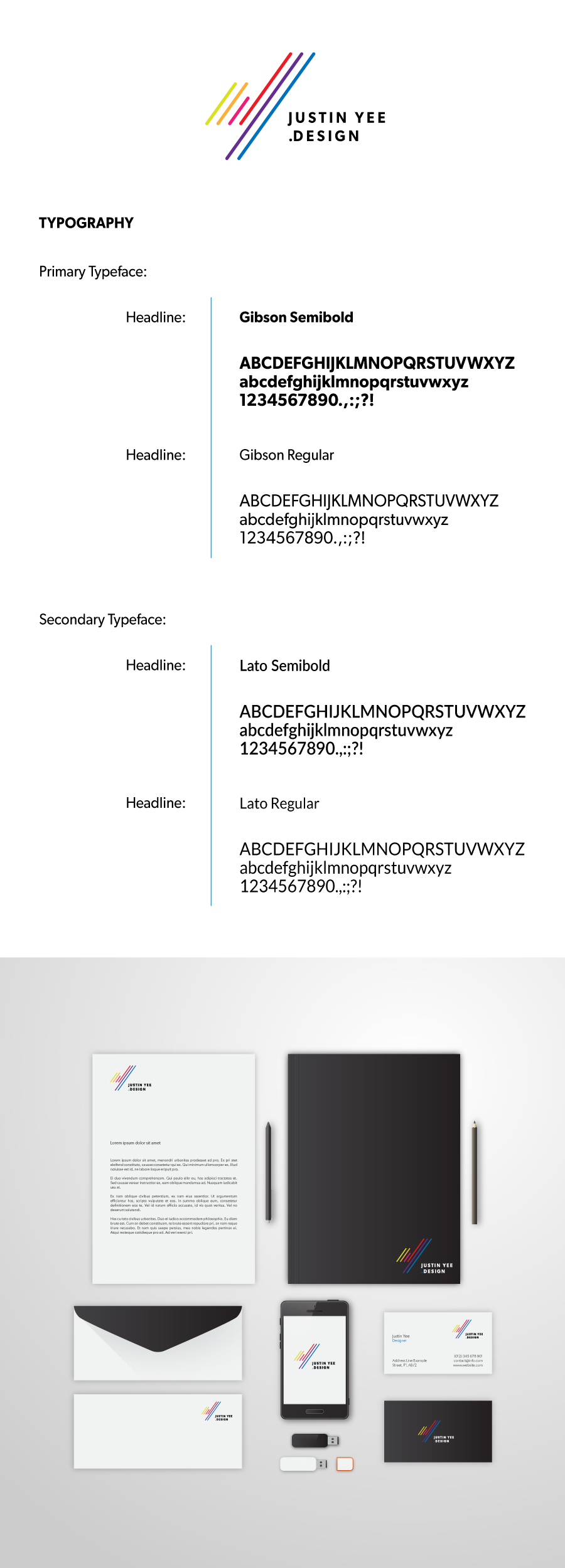
OverView:
Inspired by Uniqlo Logo creator & Creative Director Kashiwa Sato. The Justin Yee's logo employs a clean, minimalist approach, using only straight, parallel lines with rounded ends. The absence of extraneous detail or ornamentation gives it a contemporary, professional feel. The lines are arranged diagonally, ascending from left to right. It is the combination of letter 'J' and Letter 'Y'. This directionality creates a sense of movement, progress, and upward momentum—qualities often associated with ambition and growth.
Key Message:
The transition from shorter to longer lines visually narrates a journey of development—starting from a foundation and moving toward greater heights. This can symbolize personal or organizational growth, learning, or the scaling of new challenges. The use of multiple colors and parallel lines implies that different elements (people, ideas, disciplines) can move forward together, maintaining individuality while contributing to a unified direction. The diagonal, upward movement and the modern color palette communicate a brand that is innovative, energetic, and future-oriented.
- Date:May 2025
- Client:Me, Justin Yee
- Role:Branding
Identity