Cookie Mama Packaging
- Packaging
- Branding
- Logo
OverView:
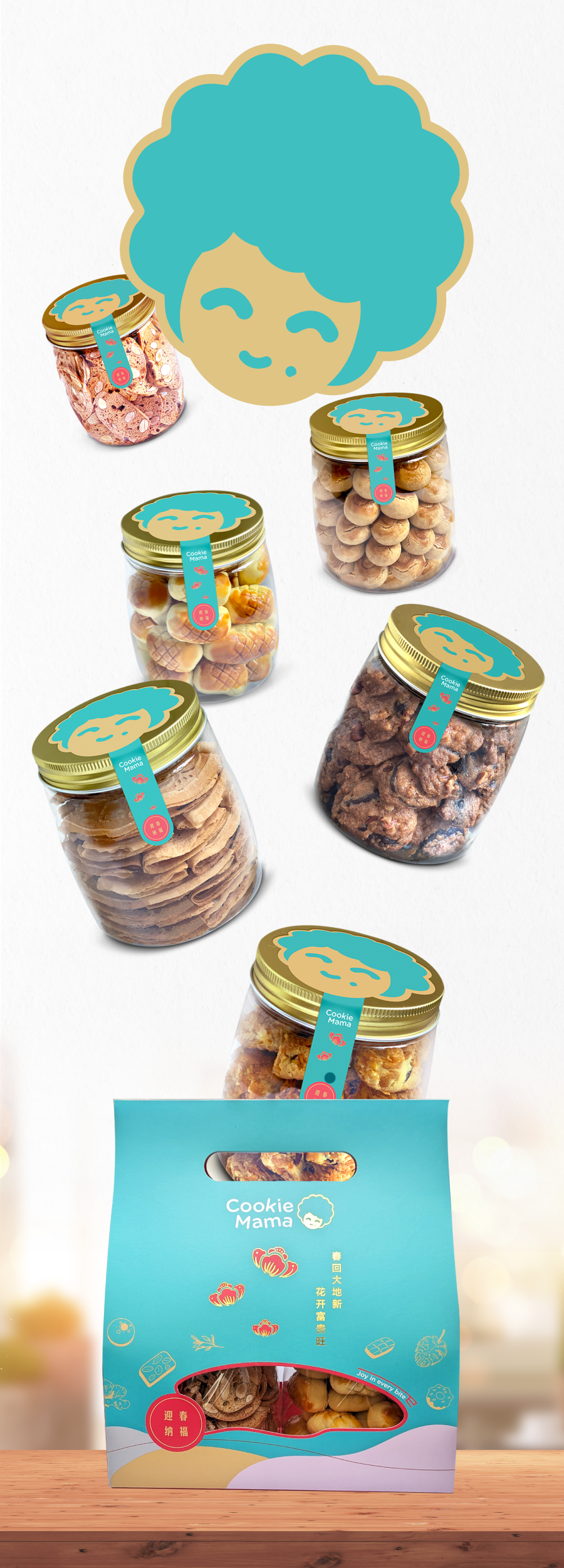
Cookie Mama is featured at Chinese New Year Food Fest 2025 (Takashimaya Shopping Centre), offering a vibrant fusion of playful visual storytelling, carefully considered user experience, and a distinctive brand identity. Thoughtfully designed for the modern gifting and snacking market, the packaging captures festive joy and makes a memorable statement—perfect for seasonal celebrations and heartfelt exchanges.
Visual Concept & Brand Persona:
At its heart, the design centers around the iconic “Mama” mascot—a stylized, clay-inspired face framed by a bold, whimsical hairstyle. This instantly recognizable character forms the emotional anchor of the packaging, evoking warmth, nostalgia, and a sense of homemade goodness. The mascot communicates approachability and reliability, instantly connecting with consumers across demographics and echoing universal associations of maternal care and home-baked treats.
Color Palette & Visual Language:
The playful turquoise blue background combined with creamy accents signals freshness and joy, creating strong shelf impact and modern appeal. The cohesive color blocking distinguishes the brand from typical, muted bakery packaging and evokes a cheerful, uplifting environment, whether at point-of-sale or as a gift. The consistent use of color extends from the outer box to the jar lids and tags, creating a tight, unified brand system.
- Date:May 2024
- Client:IM Creations Pte Ltd
- Role:Packaging
Branding
Logo